"WANG"
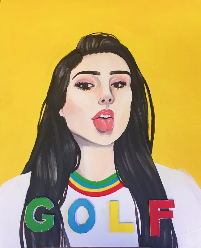
SELF PORTRAIT
ACRYLIC ON CANVAS
Inspiration
I had gone to a Tyler the Creator concert a couple of days before the self portrait was assigned, and I immediately drew inspiration from him and his clothing line/branding. I knew I wanted my piece to use his color choice and styling.
I ultimately decided on this selfie because I thought that the tongue out was unique and unexpected, adding a sort of attitude and emotion to the piece. This pose also captured the vibe of GOLFWANG, many of their portraits involve dynamic facial expressions and poses.
Reflection
What techniques did you try and master? Fail?
I tried to blend and mix the acrylic paint so that it would be a natural gradient, which I failed in doing. It was extremely difficult to find and mix the right skin tone each day, and it ended up looking rather streaky and unblended. In the future when using acrylics I may experiment with a chunky unblended style. I started by painting the face a base medium skin tone. From there I added a lighter skin tone to the lighter parts of my face, and adding a nearly white colors where the highlights of my face were. I then added a pink/orange skin tone mixture to my eyes and lips. Then I used a dark brown color to paint my hair, eyebrows, and eyes. I wanted to have a limited color palette because I feel that it often looks the best when it’s not too cluttered with different shades and hues. This however made it a bit harder to make it look cohesive, as it was a struggle to replicate the same colors each time I would work on it. The skin was difficult to paint, it didn’t blend well on the canvas so each time I wanted to create a gradient I would add a tiny bit of white paint to make the color a little lighter.
What artists were used as inspiration in the self portrait? Why these artists?
Tyler the Creator was a major inspiration for my piece. His clothing line, branding, and Instagram served as inspiration for my piece. I loved his use of bright primary colors and posing. If this had been a photograph I believe it could fit on his Instagram. GOLF WANG.
How did the critique go for you? Did you grow? Feel uncomfortable? Feel confident? Why? Elaborate.
I don't feel as though the critique was helpful, nobody was critical, it was mainly just compliments or me explaining my work.
Describe the evolution of the piece. Decisions made. Compositional elements.
The hardest decision I had to make was which selfie to base it off of. I was worried that I wouldn't be able to pull off this posing, as the selfie had a dog filter covering my nose and mouth, making it hard to do without the dog filter. However, I'm happy with how this turned out and the risk I took, as I think the tongue out adds humor and meaning to the piece.
GOLF (WANG) is the name of one of my favorite brands by Tyler the Creator. The shirt I'm wearing in the portrait is a shirt I purchased from GOLF, but rather than placing the text on my shirt I decided to bring it forward to make it pop more. I cut the text out of the same type of canvas with an exacto knife, which was probably the most difficult process in this whole piece. The canvas was thick and had a lot of frayed layers when cut, and the exacto knife wasn’t strong enough to make clean cuts. Looking back at the piece, I think it would have been better visually and physically to have made the letters out of play-dough instead
